It’s been about one year since LinkedIn last changed its profile appearance, but new changes are afoot once again for our LinkedIn profiles. I was working with a client recently, and when we jumped on her profile, there it was! A whole new design. Don’t worry if you don’t have it yet – it will be rolling out soon to a desktop near you!
But what do you need to know to prepare for this momentous occasion? Do you need a LinkedIn makeover or just a few tweaks to your LinkedIn profile?
In the following video I show you a comparison of the two profile interfaces side by side.
The Biggest LinkedIn Profile Changes and How to Make the Most of Them
Let’s take a look at some of the big differences between the old and new LinkedIn Profiles.
The first thing you might notice is the change in the
background image.
The good news is that the image size is still the same – 1584 X 398 pixels. However, if you’ve got anything important on the left-hand side, it may be covered by your picture.
Tip: You will want to adjust or create a new background image that makes the most of the new landscape.
In the case of my background image, I’ve shifted “Join the Movement” text to the right slightly, and also moved the @GoVengreso twitter handle to the right so it appears to the right of my profile headshot. Check it out.
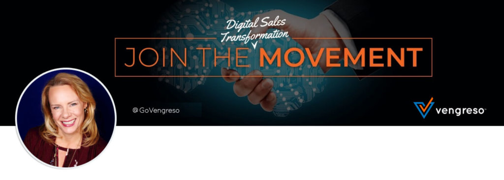 Along with your LinkedIn photo being moved over to the left of the page, your name and professional LinkedIn headline have also been pushed over to the left-hand side of the Intro Section.
Tip: Because it really makes your profile stand out, consider using the full 210 characters for your Headline (which you can only implement on mobile).
Additionally, on the right-hand side, you can now see the company, school, contact info and connections. (This is also where you edit that information.) I love that you no longer have to hunt around to edit those sections!
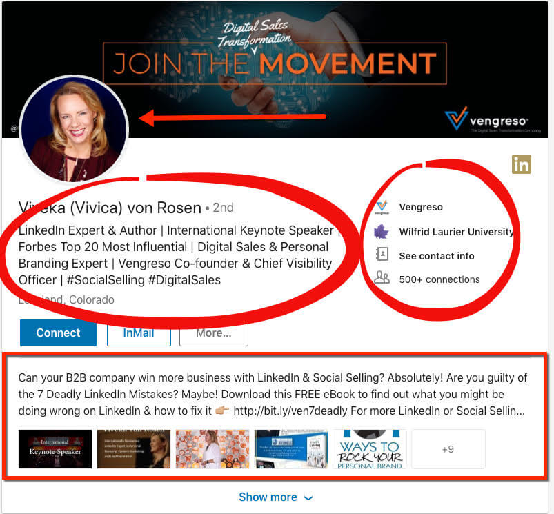
Finally, the Summary section gives you more lines of text before you have to click on the “Show more” link. You might want to revise your existing first paragraph. At Vengreso, we always recommend leading with a “call to read.” Give your readers a reason to click on “show more.” For example, I reworked my Summary introduction so that my whole eBook link is visible, and then I followed up with my contact info. This is the reverse of what I had on my Summary previously, when barely two lines of text showed.
Tip: Make sure your first three lines engage your reader to click on “Show more.”
Jump on These Profile Changes to Make the Most of your Media
The new user interface not only shows my media in the Summary, it shows a lot of it. Five out of my 14 pieces of media, in fact!
Tip: At Vengreso, we are always advising our clients to rework their LinkedIn profiles from a resume into a resource.
This new interface really allows you to highlight the resources on your profile. Make sure to audit your website and computer and upload media resources to educate your prospects!
Most of the new changes (at this time) are to the Intro or “top” section of your profile. Below that, the dashboard is the same as before. Articles and activity are still the same, as are the Experience and Education sections, and the additional sections as well.
But keep an eye on your profile (and the Vengreso blog!) because I am sure new changes are coming! If you want to learn more about the new profile – and more importantly, how to make the most out of your personal brand and how to master social selling on LinkedIn.
And if you need help creating a new profile, check out some of our LinkedIn Personal Branding and Profile Optimization options.
So, do YOU have the newest interface?
What do you think about the new LinkedIn profile?
